
Redesigned for Growth: Sign-Up Conversions Up 64%
LingoLeap is an AI-powered tool that helps students boost their TOEFL and IELTS scores.
lingoleap.ai ↗"Let's fix it."
When I joined LingoLeap in August 2024, the sign-up flow had problems like confusing paths, unclear error messages, and places where users got stuck. I looked at the data and saw that 79.7% of users left after clicking “Register.”
Sign-up is the front door. If it's hard to open, users walk away. I documented the problems, shared solutions, and my PM said: “Let's fix it.”
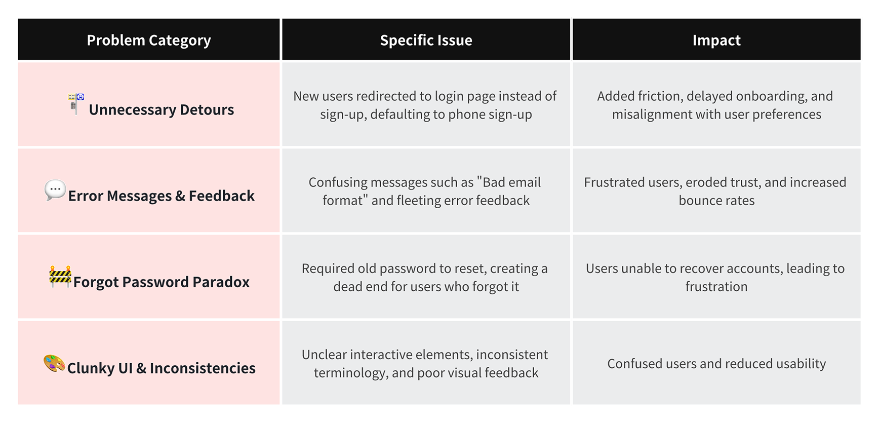
The 4 Core Issues in the Sign Up Flow
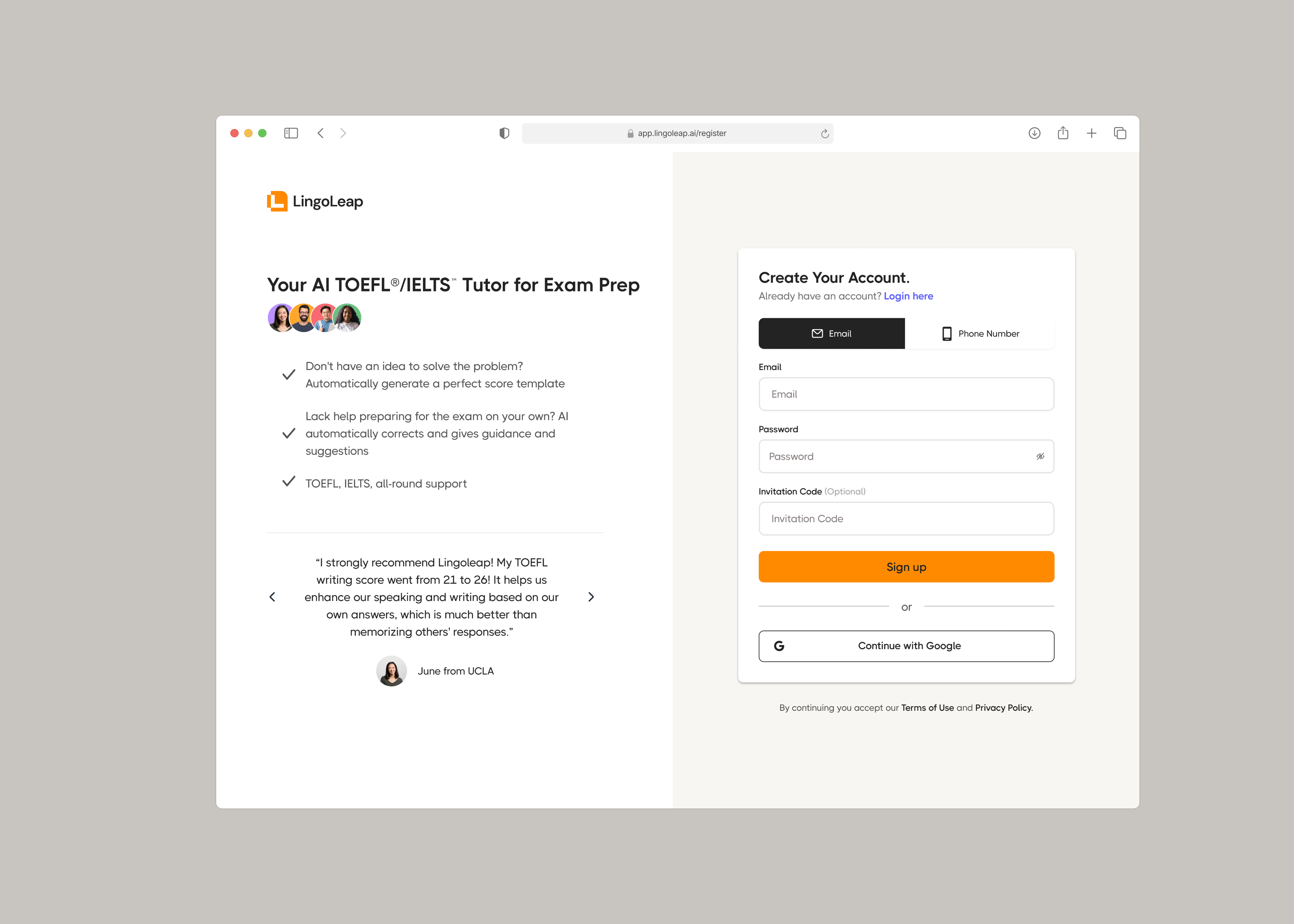
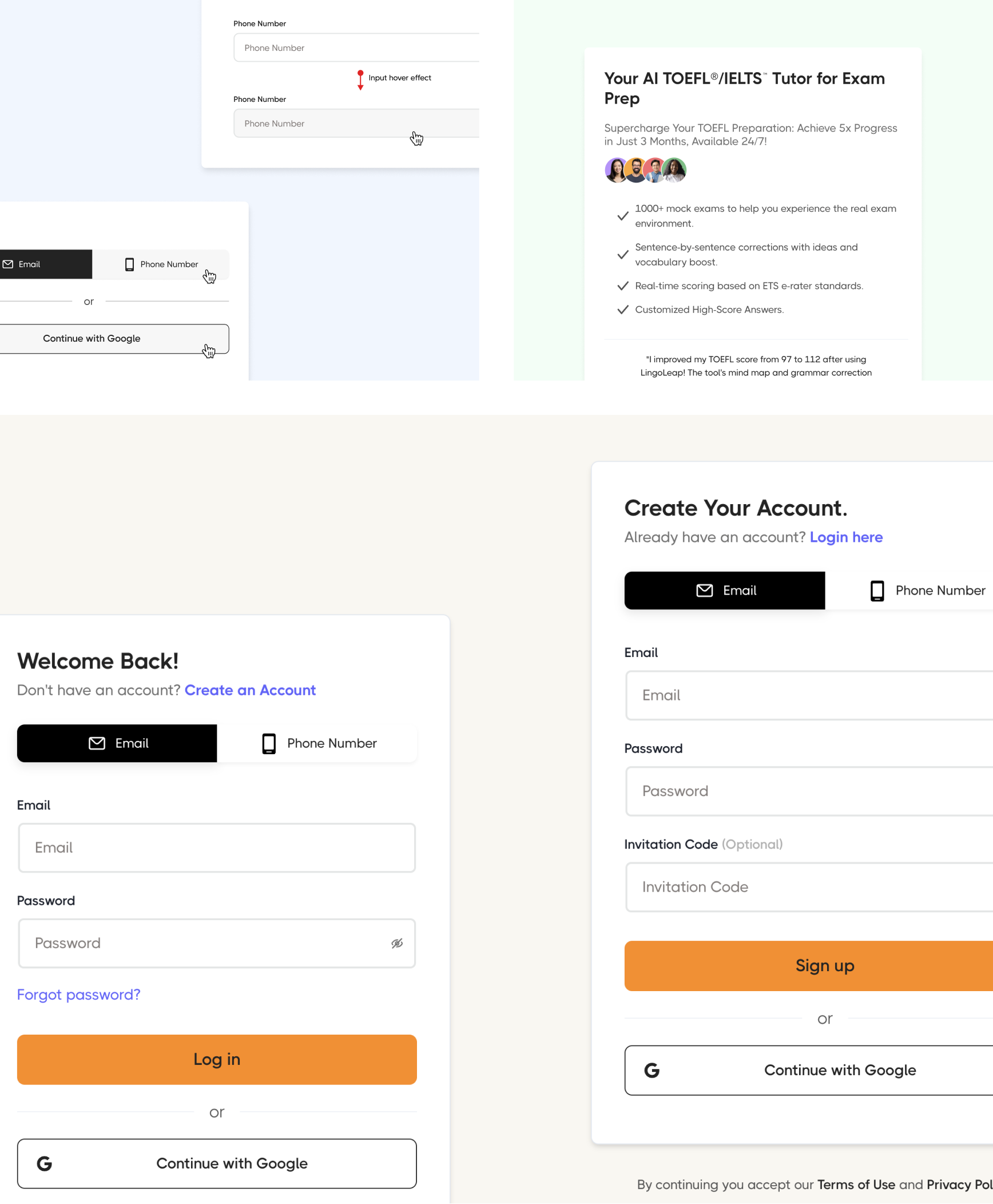
1. Unnecessary Detours and Defaulting to Phone Instead of Email
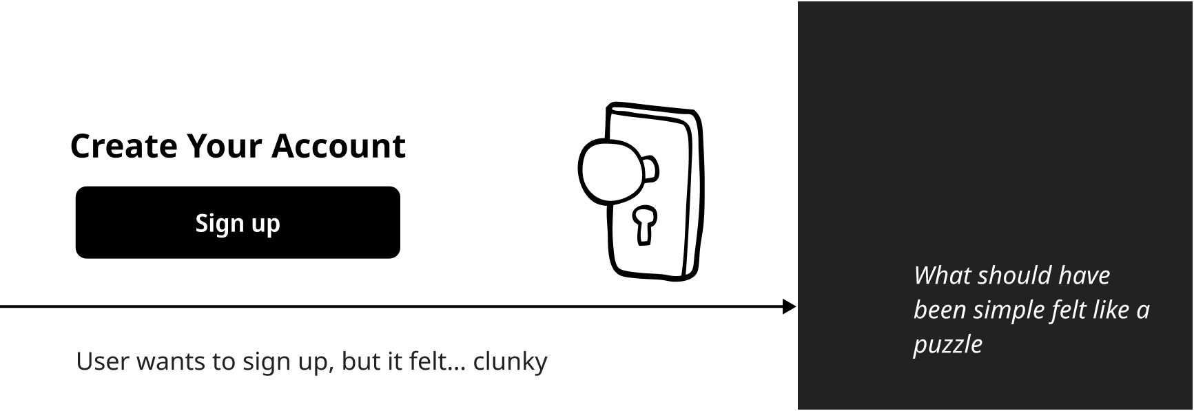
PROBLEM: Both "Login / Sign Up" and “Start Free Practice Test” buttons led to the login page, forcing users to find the "Sign Up" option manually. The default method was phone number, even though data showed that most users preferred email.
IMPACT: This caused confusion, added extra steps, and increased the bounce rate.
 Landing Page Path Leads to Login Page
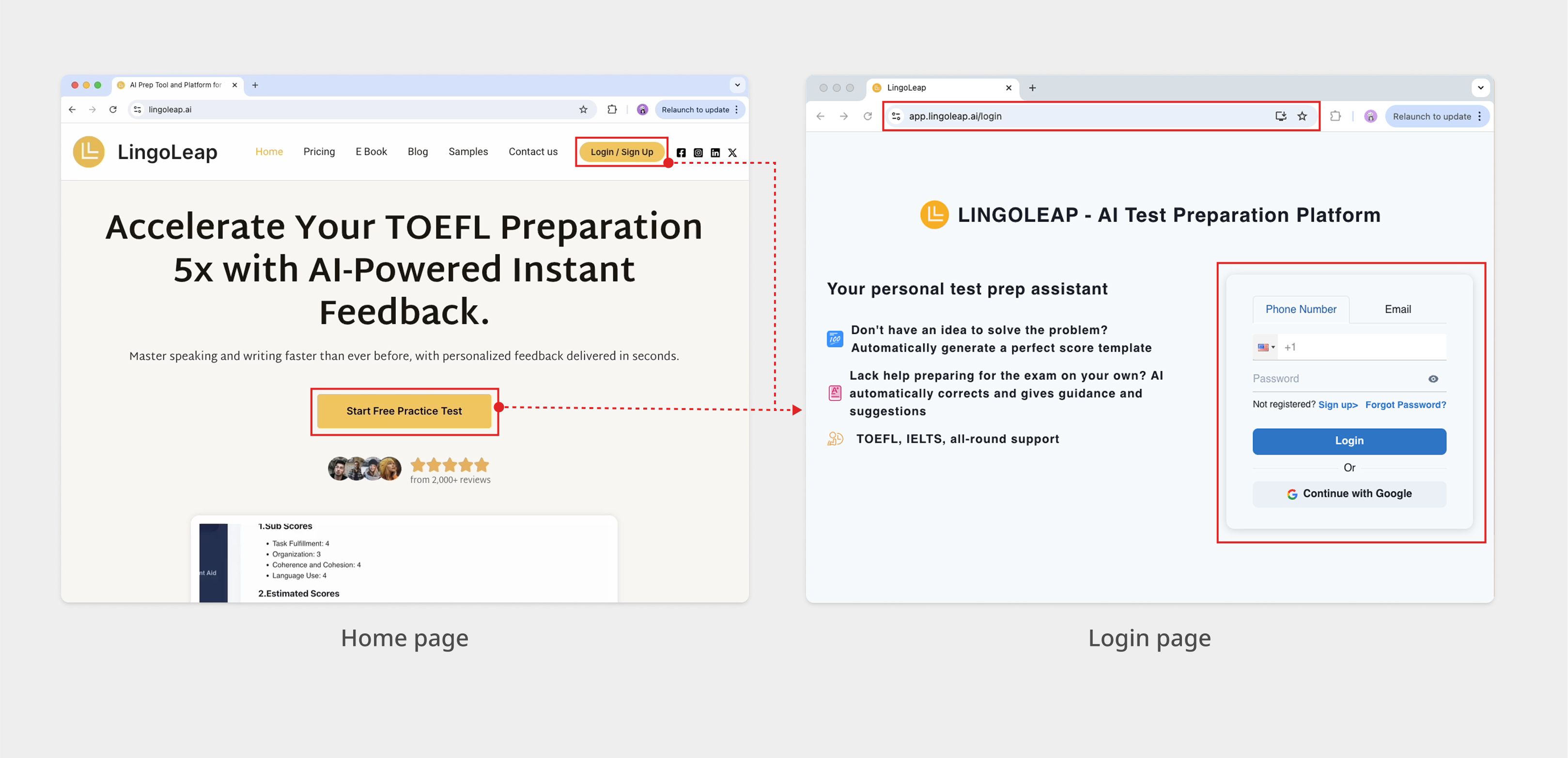
2. Confusing Error Messages
PROBLEM: Error messages like “Bad email format” or “Email can't be empty” appeared even when inputs were correct. They showed up as 3-second toasts, giving users little time to read.
IMPACT: The unclear, disappearing messages frustrated users and made the system feel unreliable during a key step in their journey.
 Confusing Error Messages
3. Forgot Password Paradox
PROBLEM: The password reset asked users to type their old password. But if they forgot it, they could not reset it.
IMPACT: This created a frustrating dead end, causing users to abandon the platform when they needed help most.
4. Clunky UI Elements and Interactions
PROBLEM: The UI had several inconsistencies and usability issues:
- The phone number and email tabs looked like text, not buttons.
- Some places said "Register" and others said "Sign Up," with different capital letters.
- There was no clear sign when a user clicked into a text field.
IMPACT: These inconsistencies confused users, making the interface feel unpolished.
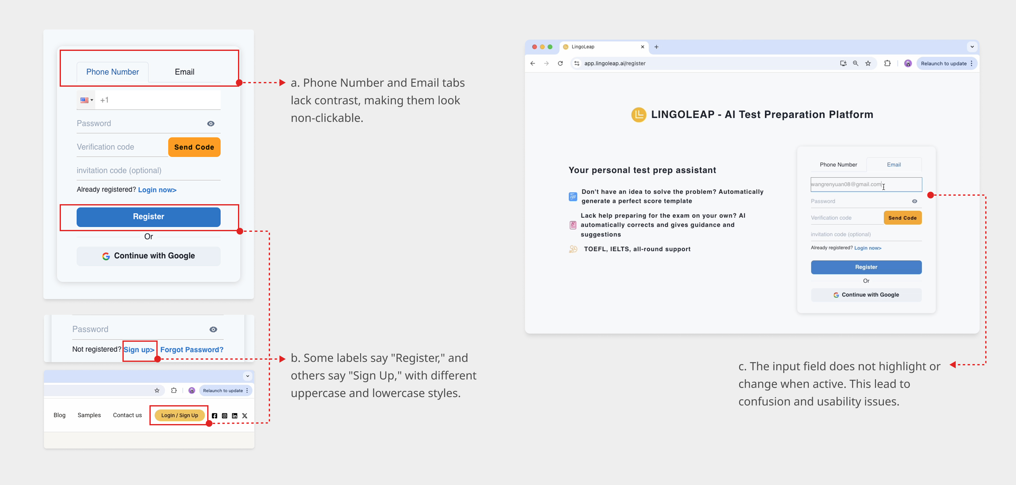 Unpolished UI Issues
Recap
The sign up flow had usability issues that created friction. This caused users to leave and gave a bad first impression. To fix this, the goal was to make the process smoother, easier to understand, and better for users. Here are 4 main issues we found:
 Recap of Key Usability Issues
Design Direction
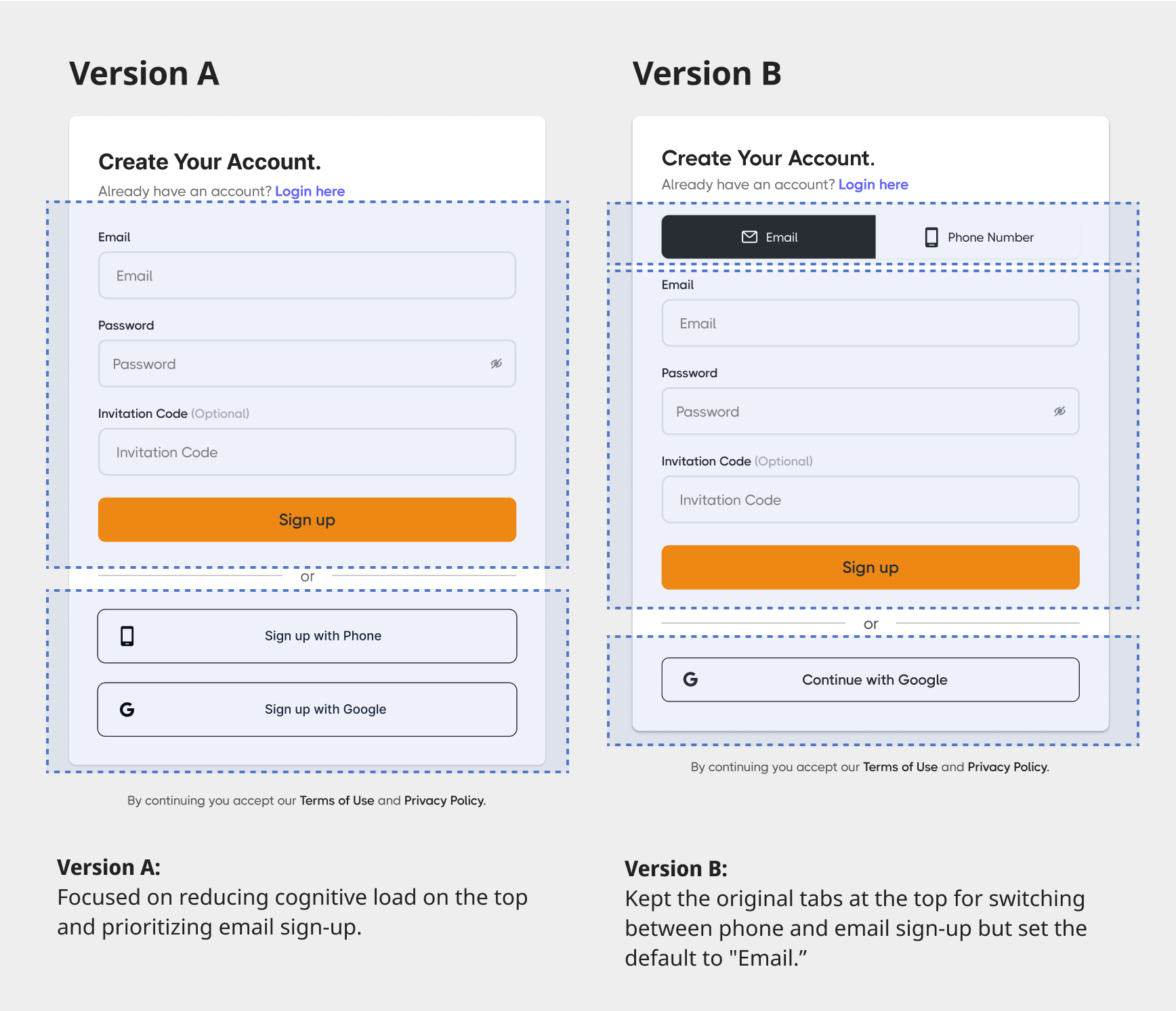
To make the sign-up flow easier, I tried two different designs.
- Version A put phone and Google sign-up options under an “or” section to keep things simple for email users.
- Version B kept the original tabs for phone and email, with email as the default since most users preferred it.
After evaluating user needs and stakeholder constraints, Version B was selected as the final solution. It accommodated users who prefer phone sign up and minimized changes to the codebase.
 Version A vs Version B
Refining the Flow and Layout
After choosing Version B, I focused on making the sign-up process smoother and easier to follow. To fix the main problems, I made the following changes:
 Turn the Chaos Into Clarity, One Pixel at a Time
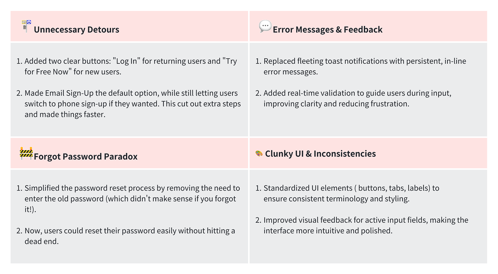
🚏Unnecessary Detours
I redesigned the landing page to help new users get started more easily. I added two clear buttons: "Login" for returning users and "Get Started" for new users. This made the flow simpler and more welcoming, while also helping us track user behavior better.
Set email as the default sign-up option, since most users prefer it. The phone option is still easy to find for those who need it. This simple change removed extra steps and made the process faster.
💬Error Messages & Feedback
I replaced the floating toast messages with clear, visible error messages that stay on the screen until the problem is fixed. This way, users don't have to guess what went wrong.
🚧 Forgot Password Paradox
For the forgot password flow, I fixed a critical bug that required users to enter their old password.
🎨 Clunky UI & Inconsistencies
I standardized buttons, tabs, and labels for a consistent look and feel. I improved visual feedback for input fields and followed the new brand guidelines, ensuring consistent language, proper interactions (focus states, hover effects), and alignment with marketing messages. To make the marketing panel more engaging, I highlighted key benefits with clear bullet points, added real user testimonials to build trust. I also added "Create Your Account" for new users and "Welcome Back" for returning users to make the page switch clear and easy to understand.
 Standardizing UI & Interaction Effect
Last but Not Least, Attention to Detail
I added a support option "If you still need help, contact support@lingoleap.ai" for users who might get stuck. The site is now responsive for all screen sizes, and for mobile users, the text boxes show appropriate keyboards for entering phone numbers, email addresses.
 Support Option is Added
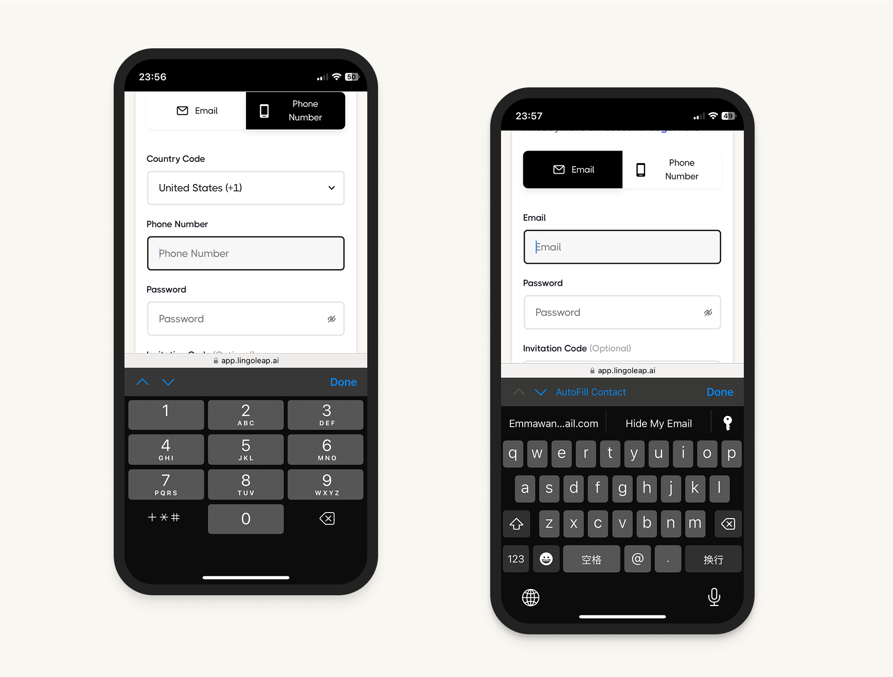 Fields Show Appropriate Keyboards
Outcomes
After finalizing the redesign, product managers reviewed it and praised its attention to detail. The updated design moved quickly into development. After the redesign rollout, we saw a 64% increase in sign up conversions. Stakeholders commented on the redesign as a success, emphasizing its positive impact on both user engagement and business goals.
Project Takeaways
This outcome underscores the value of industry best practices. Even though sign up processes are standard, they require careful consideration of user habits and data analysis to guide design choices. Imagine offering a free sample, but the door is jammed. How likely are users to come back? For a B2C platform, attracting and onboarding new users is critical to success. By focusing on user habits and data insights, we ensured the sign up process was clear, intuitive, and welcoming.
Key Takeaways Include:
- Attention to Detail: Small improvements, like clear error messages and responsive design, significantly boost user satisfaction.
- Collaboration: Working closely with stakeholders ensured the design was and aligned with business goals.
- Data-Driven Decisions: Using analytics helped us make informed design choices.